Disinteractive
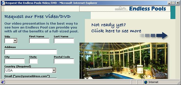
After I posted yesterday about an ad which was larger than the pop-under window, I've seen a couple like it. However, this one represents a stunning achievement of oversight:

Look carefully at how the edit boxes disappear off the edge of the displayed area. You can use the TAB key to move to the other controls and the submit button, but the window suppresses its natural scroll instinct. By making it less user-friendly, the ad-dishing company seems to understand that the user's going to just close the ad anyway, without actually trying to get more information from the ad-disher's client.
Crikey! They're more cynical than I am!

0 Comments:
Post a Comment
<< Home