Friday, June 04, 2004

The Technology War Escalates

TechDirt reports that pop-up advertisers are working to thwart the pop-up blocking technologies deployed by Yahoo!, Google, and so on.

Of course they are. Because stupid people respond to pop-up ads.

There's your enemy. The solution is education, not technology or legislation. Hey, that's what I am here for.

It's certainly not the power, fame, fortune, or hot chicks depicted in the pop-up ads.

I Hope It's 3-D

Kudos to whomever's delivering Xerox's ads to Dilbert.com, because they're spitting up two pop-up windows with the very same ad in them on loading the Web site:

The Twin Xerox Ads

Perhaps the user should move them, adjust the color on the monitor, and put on 3-d glasses for some extra effect. I don't know.

Maybe the subtext is Xerox copies. I don't know.

I do know it's not just this particular ad, though; sometimes I've seen other Xerox ads duplicated.

Who cares? Just takes two clicks instead of one to close them.

Wednesday, June 02, 2004

When You're Too Lazy For Drudge

So, you want to be a hep cat and get your news off of the "Internet", but you're too stupid to remember the URLs for The Drudge Report, Fark, Fox News, or CNN? Perhaps you're too lazy to type the URL into your Web browser. Fortunately, there's a solution for you!

Got news?

Daily delivery to your inbox. That is, once a day.

That way, you can also sacrifice the real-time advantage the World Wide Web offers, too.

We won't give your address to spammers! Undoubtedly true, but you'll probably receive an e-mail filled with sponsors and mere links to stories that take you to pages laden with flashing advertisements....and that's the best for which you can hope.

Sign me down.

Disinteractive

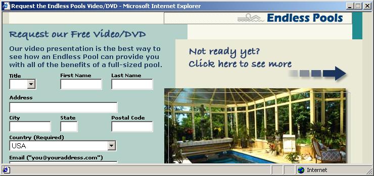
After I posted yesterday about an ad which was larger than the pop-under window, I've seen a couple like it. However, this one represents a stunning achievement of oversight:

Ad too large, but without a scrollbar.

Look carefully at how the edit boxes disappear off the edge of the displayed area. You can use the TAB key to move to the other controls and the submit button, but the window suppresses its natural scroll instinct. By making it less user-friendly, the ad-dishing company seems to understand that the user's going to just close the ad anyway, without actually trying to get more information from the ad-disher's client.

Crikey! They're more cynical than I am!

Tuesday, June 01, 2004

Change in Policy

I'm going to start posting the screen captures in their full sizes so you can see the ads without extra work. You don't like it? Don't come back! Of course, you're not here now, so I'm not really insulting you. No, please, don't go.....

Promising

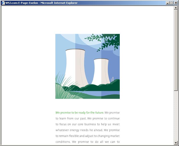
Hey, check out this Exelon ad:

Scrollbar in ad

Is it genius in making an interactive ad which the user must scroll to read the litany of market fluff, or poor design? I just don't know!

No Bananas for Your Code Monkey

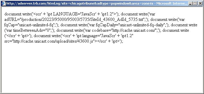
Thanks for sharing your technical ineptitude, fellows:

JavaScript error in pop-up

Back to the restaurant counter for that fellow.

On the other hand, it's more educational for viewers than whatever ad should have appeared.